Earlier this month, General Motors revealed a redesigned GM logo—which got us thinking about some of the more memorable automobile brand emblems.
While we’ve done similar exercises before, they were mostly centered on specific vehicle models, so this time we decided to focus on vehicle marques.
Some logos we chose simply due to their prominence, some we chose thanks to their origin stories. Take a look and let us know what we missed in the comments section below.
***
10. Dodge Ram
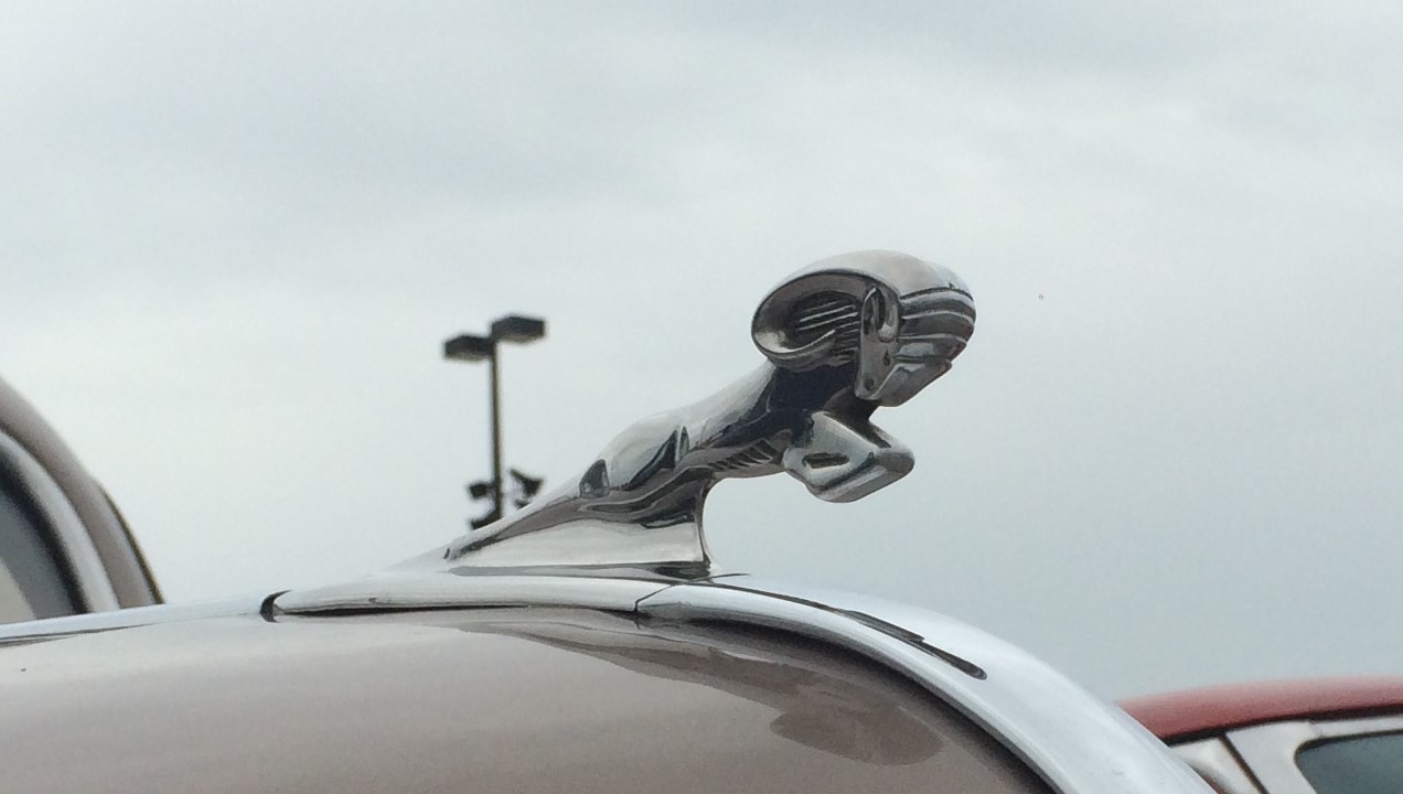
Did you know that Dodge had been using a Ram as a de-facto mascot since before World War II? While it took a few decades to become the official brand logo, the familiar Ram’s head graced the hoods of plenty of Dodge cars and trucks in the meantime. The Ram was so popular in fact, that it lent its name to Dodge’s line of pickup trucks in the early 1980s and ultimately became the figurehead of the eponymous truck brand when Dodge restructured in 2010.
***
9. Subaru Pleiades
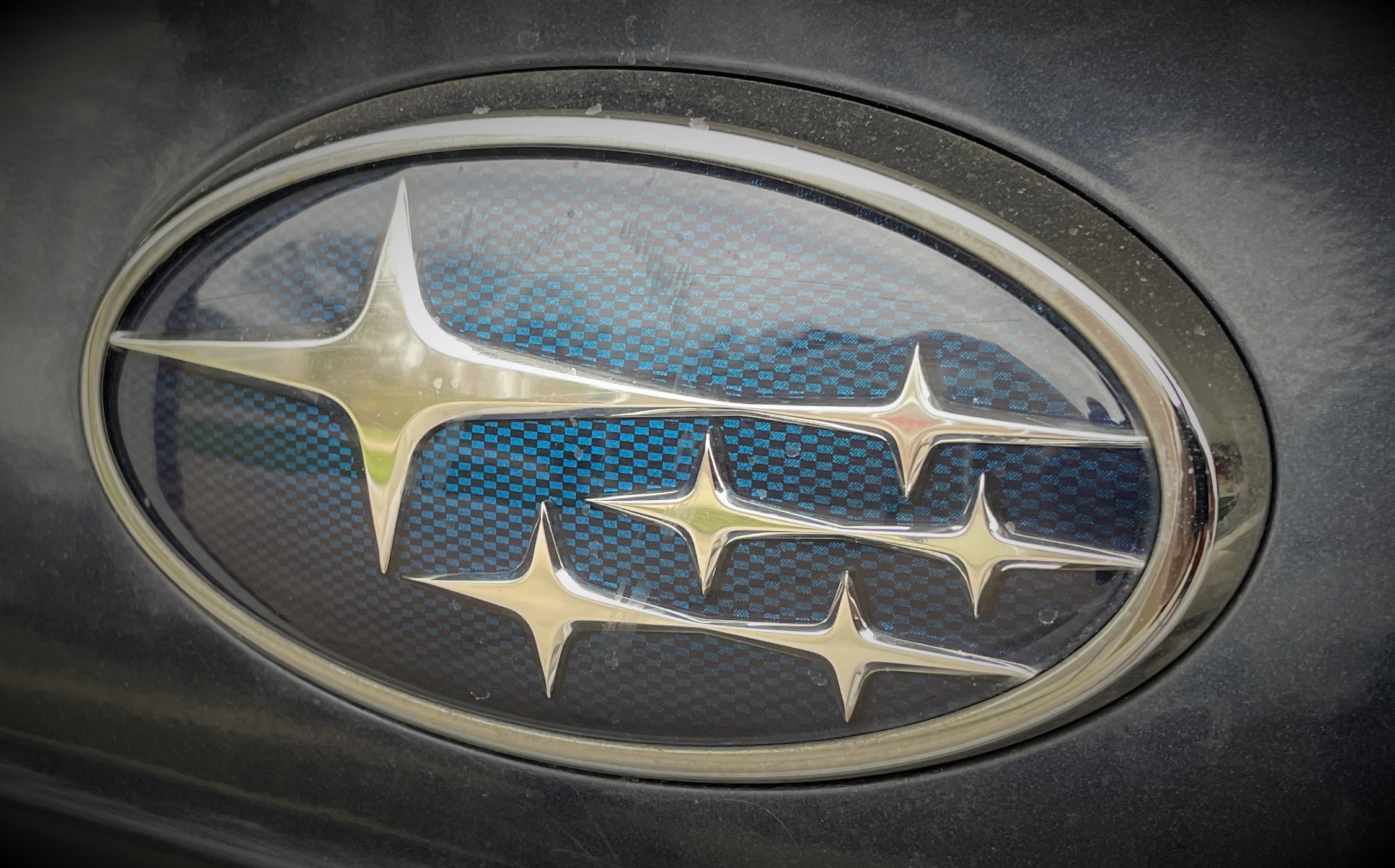
First off, it’s a stylized depiction of the Pleiades star cluster. But ever wonder what the stars on the Subaru logo represent? Dig a bit deeper and you’ll see that the emblem contains five smaller stars and one large star. That’s supposed to symbolize the five smaller Japanese companies that merged to form the large star, Fuji Heavy Industries—the company that would eventually become Subaru.
***
8. Cadillac Crest
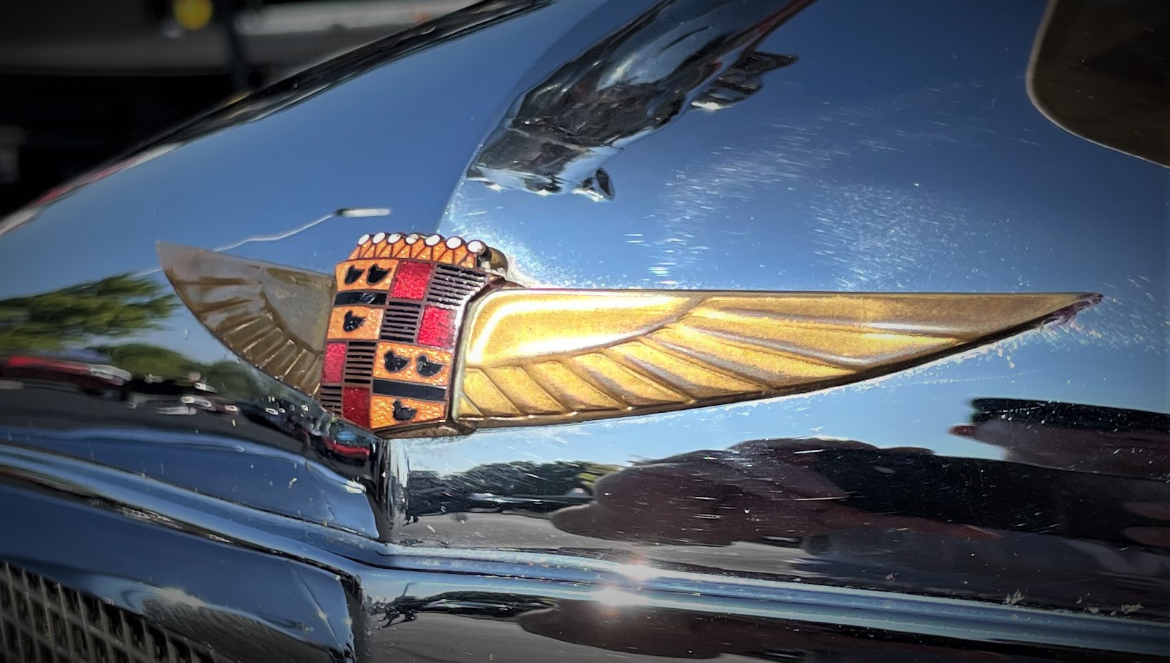
While it’s gone through dozens of evolutions, with laurels, wings, and assorted accouterment, the Crest at the heart of the Cadillac logo has remained consistent. We’re big fans of the 1930s version depicted above, as it seems emblematic (pun intended) of the class and elegance of the final days of the art deco movement.
***
7. Oldsmobile Ringed Globe
Curiously, this is the list’s only logo from a marque that no longer exists. Oldsmobile’s emblems went through several significant revisions, often leaving behind valuable brand recognition in the process. Perhaps if Olds had stuck with its futuristic space-focused imagery of the pre-war and immediate post-war era, things would’ve turned out differently?
***
6. Alfa Romeo Visconti Serpent
There’s a lot to unpack here. On the left is the flag of Milan, Alfa’s hometown (easy enough). On the right is…wait…is that a snake eating a guy? Turns out, it’s an adaptation of a crest that originated in Medieval Crusades: The Visconti Serpent.
***
5. Harley-Davidson Bar & Shield
In the tattoo hall of fame, the familiar Harley-Davidson logo would snug in nicely between the anchor and “Mother” heart. Go to any public event, and you’ll likely to see some variation of this logo on a t-shirt, hat, or bicep. And it’s one of the few logos that’s earned its own identity. Simply say “Bar & Shield” to any motorcyclist, and they’ll know exactly what you’re talking about.
***
4. Chevy Bowtie
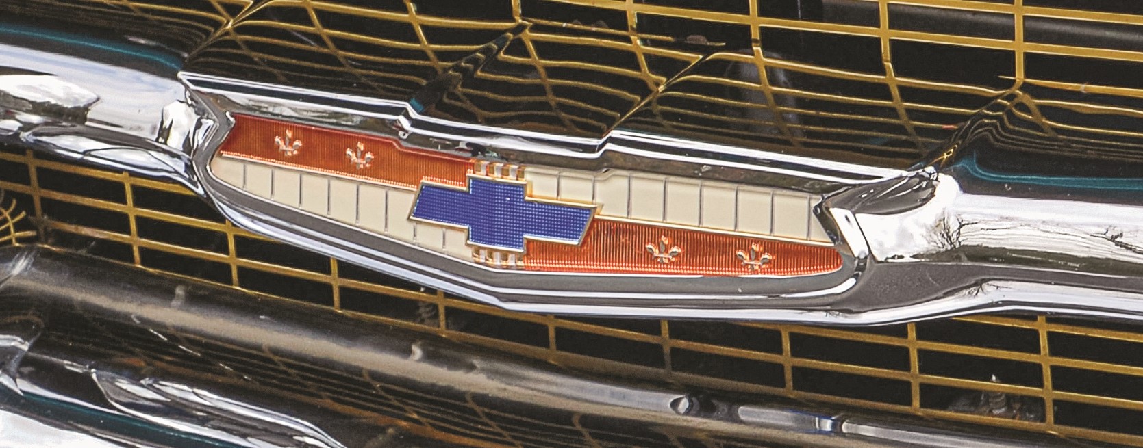
Like the Bar & Shield above, this is another logo that has a universally-understood first name: The Bowtie. And while its origins aren’t exactly clear, Chevy co-founder Charles Durant said the emblem was inspired by a hotel’s wallpaper. The GM Corporate Newsroom has a much more detailed history. The Bowtie has endured several evolutions, but we like the one that preceded the 1976 Bicentennial (and Chevy’s Spirit of America special editions).
***
3. Ferrari Prancing Horse
Nope. Our fondness for this logo has nothing to do with the cars that bear them. (Though they are amazing.) Instead, we like its origin story, delivered by Enzo Ferrari himself. The Prancing Horse was taken right from the fuselage of World War I fighter ace Francesco Barraca’s Spad biplane. Ferrari put the horse on a yellow field and complemented it with the familiar green-white-red striping of the Italian flag.
2. Citroën Chevrons
Citroën’s been putting a pair of chevrons on its vehicles literally since day one. And the reason why is beautiful. It all starts over 100 years ago, when company founder André Citroën had the genius idea to use gears with a double-helical tooth configuration in a vehicle transmission. The result was a smoother, quieter, and more efficient automobile. Citroën simply adapted the gears’ familiar herringbone mesh pattern into his company’s logo, hence the chevrons.
***
1. Ford Blue Oval
The signature script F-o-r-d showed up around 1907, just a year before the Model T arrived to mobilize America. The Ford name was enclosed in a circle soon afterwards, making way for the Blue Oval to officially appear in 1927, on the Ford Model A. It has since become one of the most recognizable logos in history, right alongside the script Coca-Cola and Nike Swoosh. (Ford’s got an entire section of its website dedicated to its history, check it out.)
***
So, what’d we miss? Is there a car, truck, or motorcycle manufacturer logo that deserves to be on this list? Give us your argument in the comments section below—we’d love to hear it.
[…] Earlier this month, General Motors revealed a redesigned GM logo—which got us thinking about some of the more memorable automobile brand emblems. While we’ve done similar exercises before, they were […] Read full article at http://www.onallcylinders.com […]
How about Aston Martin, Jaguar, Lotus, Porsche, Maserati, Bugatti, BMW, Mercedes-Benz,& Volvo.
Those are some solid suggestions, Bert!
…
Honestly BMW was a runner-up simply to dive into the logo’s propeller myth and Lotus was up there too, to explain the ACBC embedded in the logo. But alas, we wanted to limit the list to just 10.
…
(And we’d be remiss in not mentioning the “Prancing Moose” of course.)
A great list and hard to argue. But how could you leave out Lamborghini? Its history “in the dirt” is an amazing story – even their tractors are fast & beautiful! Thanks for the fun list and for including the long forgotten Oldsmobile! My first car was a 1981 Cutlass Supreme Coupe, diesel (yes, you read that correctly). It even had factory GM duel exhaust for all those fumes and cackle!
Ya know… the Summit logo has had a number transitions too. I still have a copy of my race car Summit drivers license.. circa… late 70’s. Quite a history
Hey Wayne, you may find this story interesting too. We wrote it for Summit Racing’s 50th anniversary.
How about international three diamonds logo ?
You mean this one? We actually spotted that on a Scout II powered by a Nissan diesel engine! Regardless, it’s another solid choice, and it’s really neat how they’ve kept the diamond motif with the modern logo too. (Also noteworthy, the IH “man on a tractor” logo!)